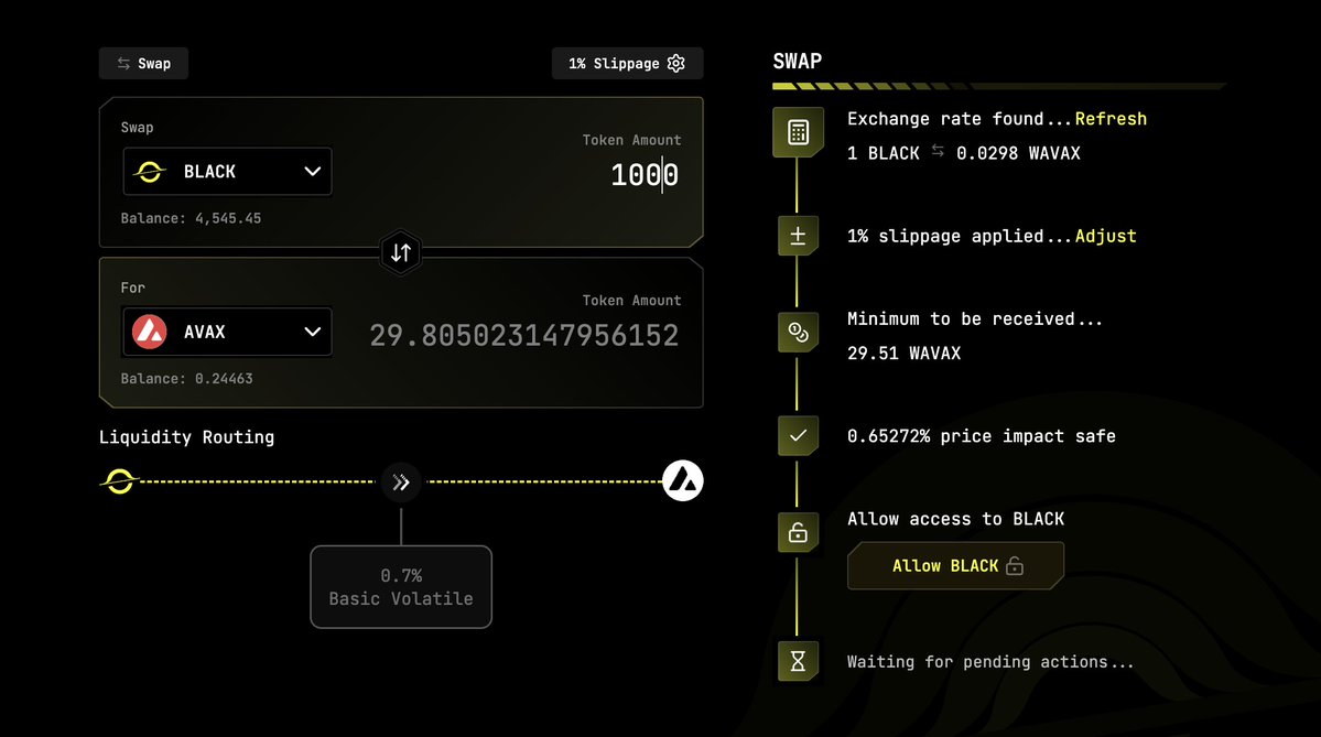
Suggest a very serious UX revamp on @BlackholeDex
One of the main UX design principles is keep actions grouped closely together.
The button to "Allow" is buried in a weird cascade of messages and is completely unfamiliar.

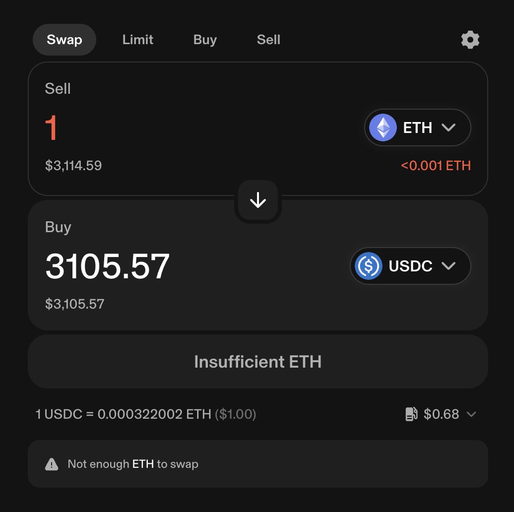
Moreover, once a design pattern is strongly established, you just follow it.
Read: "Don't make me think"
Logos go in the top left corner. It's not up for you to be creative.
@uniswap still has the undisputed best and industry standard UX.
Stop making people think.

@Uniswap Token may still pump and be bullish.
idk
But it's bad UX.
Let me back up my point here with my own work.
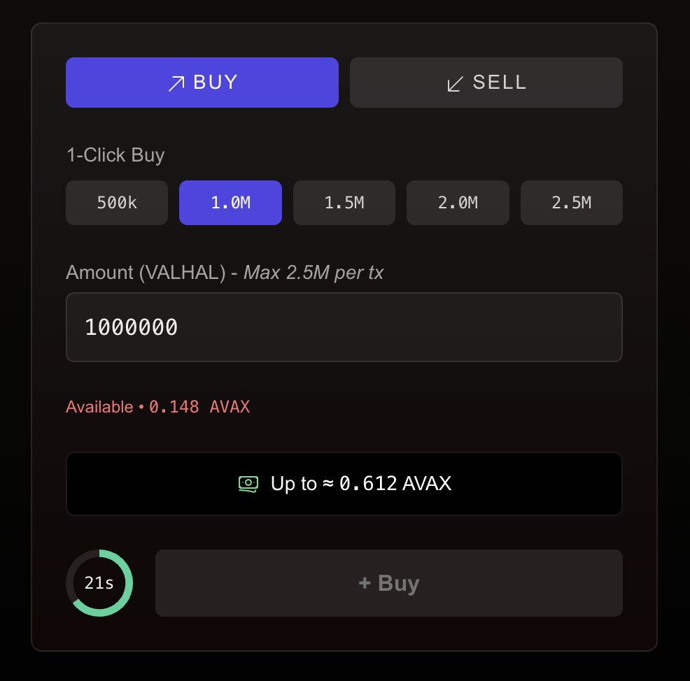
@fizsocial has some weird properties with limiting how much you can buy per minute during bonding.
The buy needs to be "exact out" so that you don't get failed transactions due to slippage.
I designed a tight UX that is *very* similar to Uniswap but with a few key differences.
It should be familiar in all the ways a user expects, and make it clear what the differences are.
And tbh, I still have some work to do on this.

4.77K
76
The content on this page is provided by third parties. Unless otherwise stated, OKX TR is not the author of the cited article(s) and does not claim any copyright in the materials. The content is provided for informational purposes only and does not represent the views of OKX TR. It is not intended to be an endorsement of any kind and should not be considered investment advice or a solicitation to buy or sell digital assets. To the extent generative AI is utilized to provide summaries or other information, such AI generated content may be inaccurate or inconsistent. Please read the linked article for more details and information. OKX TR is not responsible for content hosted on third party sites. Digital asset holdings, including stablecoins and NFTs, involve a high degree of risk and can fluctuate greatly. You should carefully consider whether trading or holding digital assets is suitable for you in light of your financial condition.

