NEAR - Supply Mapping Understanding the driving forces behind market changes @NEARProtocol
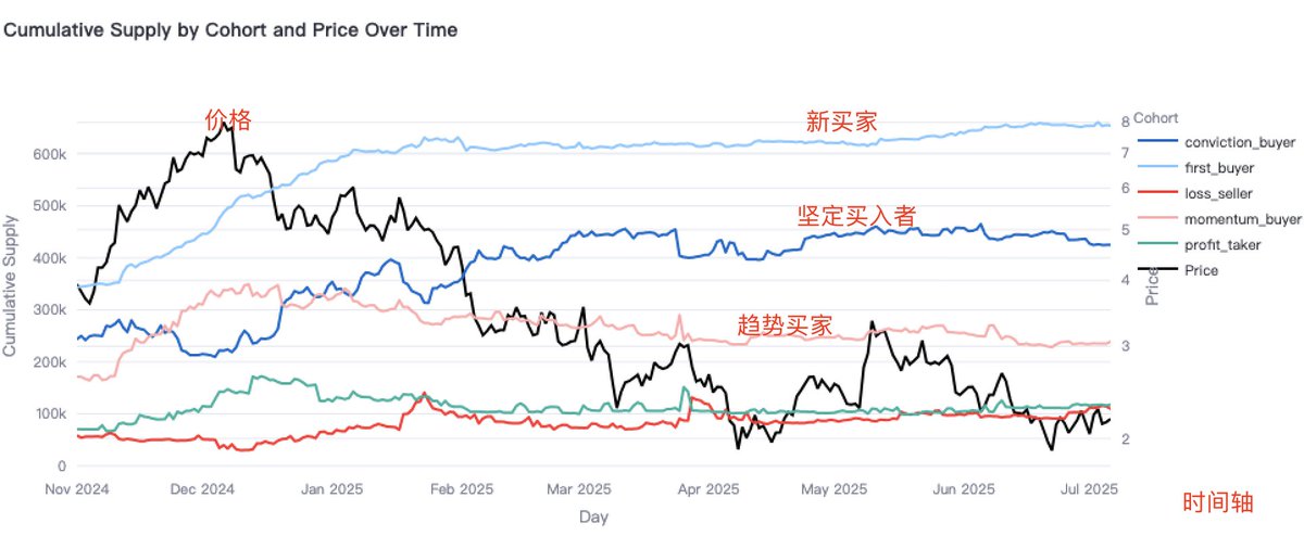
A behavior-based group has been created:
Strong Buyers: Investors who continue to buy even when prices drop. They believe in long-term trends and use this to lower their cost basis.
Momentum Buyers: Investors who buy during an upward trend, usually increasing their average cost basis.
First-time Buyers: Buyers entering the market for the first time - a brand new starting point.
Loss Sellers: Investors who exit at a loss.
Profit Takers: Investors who lock in profits.
This time we used a curve comparison, which may be more intuitive. The following chart shows the trend energy of various behavioral groups since last November.
From the chart, we can see that
When momentum trend buyers start to become active, it may signal the beginning of a new trend. The chart shows that trend buyers became active in November-December of last year @NEARProtocol
Prices also rose, but currently, trend buyers are quite inactive, and prices are weak.
Strong buyers have stabilized after their purchases. New buyers are also temporarily quiet.
Perhaps we need to wait for new ones.
From a larger cycle perspective, it still closely follows the trend of BTC. Continuing to pay attention.
@NEARProtocol @KaitoAI

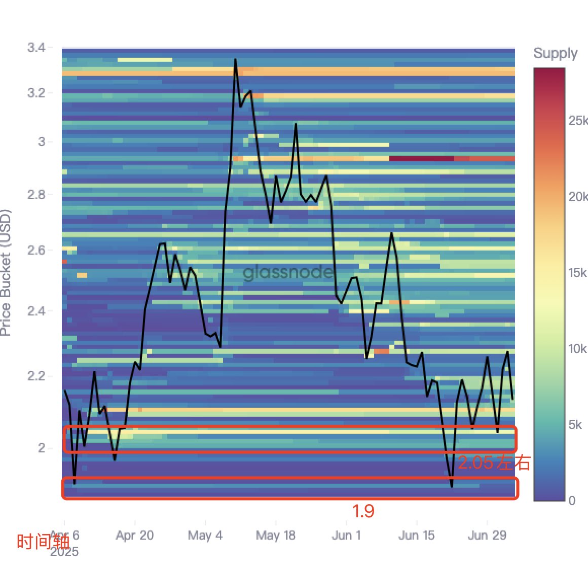
NEAR's CBD data, Cost Basis Distribution data (CBD)
What is CBD? @NEARProtocol
Cost Basis Distribution (CBD) enables investors to do two key things:
Absolute Value (Key Cost Basis Levels): CBD reflects the total supply held by addresses with an average cost basis within a specific price range, as indicated by the z-value (color intensity) of the heatmap.
Dynamic Time Series: The time series view allows you to see how the token supply acquired at different price levels is redistributed as future prices change.
The Cost Basis Distribution (CBD) heatmap visually presents the supply density at different price levels over a specific time period (e.g., 1 month, 1 year).
After selecting a time range, this indicator will display a heatmap where the y-axis represents the logarithmic scale of cost basis, set to range from 1% below the lowest price to 1% above the highest price within the selected time period. The color intensity of each pixel reflects the concentration of supply at that price level, allowing investors to identify where significant portions of asset supply come from.
Clearly shows the trend of how the cost basis of chips changes over time. Unlike analyzing UTXO-based URPD data, CBD calculates the average cost basis for each address, better representing the overall behavior of holders.
@NEARProtocol CBD is shown in the figure. It is recommended to compare the trend with the overall market trend and pay attention to the project's operational situation. For reference and learning, thank you all.
@NEARProtocol @KaitoAI

5.61K
75
The content on this page is provided by third parties. Unless otherwise stated, OKX TR is not the author of the cited article(s) and does not claim any copyright in the materials. The content is provided for informational purposes only and does not represent the views of OKX TR. It is not intended to be an endorsement of any kind and should not be considered investment advice or a solicitation to buy or sell digital assets. To the extent generative AI is utilized to provide summaries or other information, such AI generated content may be inaccurate or inconsistent. Please read the linked article for more details and information. OKX TR is not responsible for content hosted on third party sites. Digital asset holdings, including stablecoins and NFTs, involve a high degree of risk and can fluctuate greatly. You should carefully consider whether trading or holding digital assets is suitable for you in light of your financial condition.

